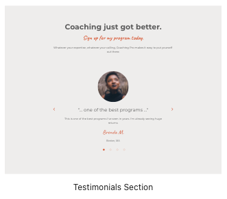
This section can be used to show your testimonials and accomplishments, increasing trust from your users.
Block Pattern
This section is created using the Testimonials Section block pattern.
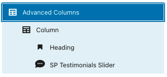
This block pattern contains the following blocks:
Advanced Columns
- Column
- Heading
- SP Testimonials Slider
Block Settings
By default, the blocks have the following settings assigned:
Advanced Columns
Block Width: Full-width
Column count: 1
Column Inner Max Width: 800px
Padding Top: 80px
Padding Right: 40px
Padding Bottom: 80px
Padding Left: 40px
Background Color: Background color 1
Column
Text align: center
Heading – H2
(default settings)
SP Testimonials Slider
Sort Posts By: Random
Show Featured Images: enabled
Image Border Radius: 50%
Autoplay: enabled
Display Time: 3 seconds
Animation Style: fade
Show Arrows: enabled
Arrows Style: Style 1
Show Dots: enabled
Vertical Align: middle
Sync Padding: enabled
Padding: 0
Arrows Color: Color 2
Arrows Hover Color: Color 3
Dots Color: Color 2
Dots Hover Color: Color 3
Author Name Color: Color 2
See the Theme Colors article for an explanation of the color palette.


